
Page content
1. Affordance and Signifiers
Let’s start with a bit of theory:
- Affordance is everything an object can do and is made physically possible by its properties.
- Signifiers are used to clarify to the user what the affordance of an object is.
Affordance is what an object can do and a signifier explains this to the user.
Janao Denys, Business & Service Designer – Quest
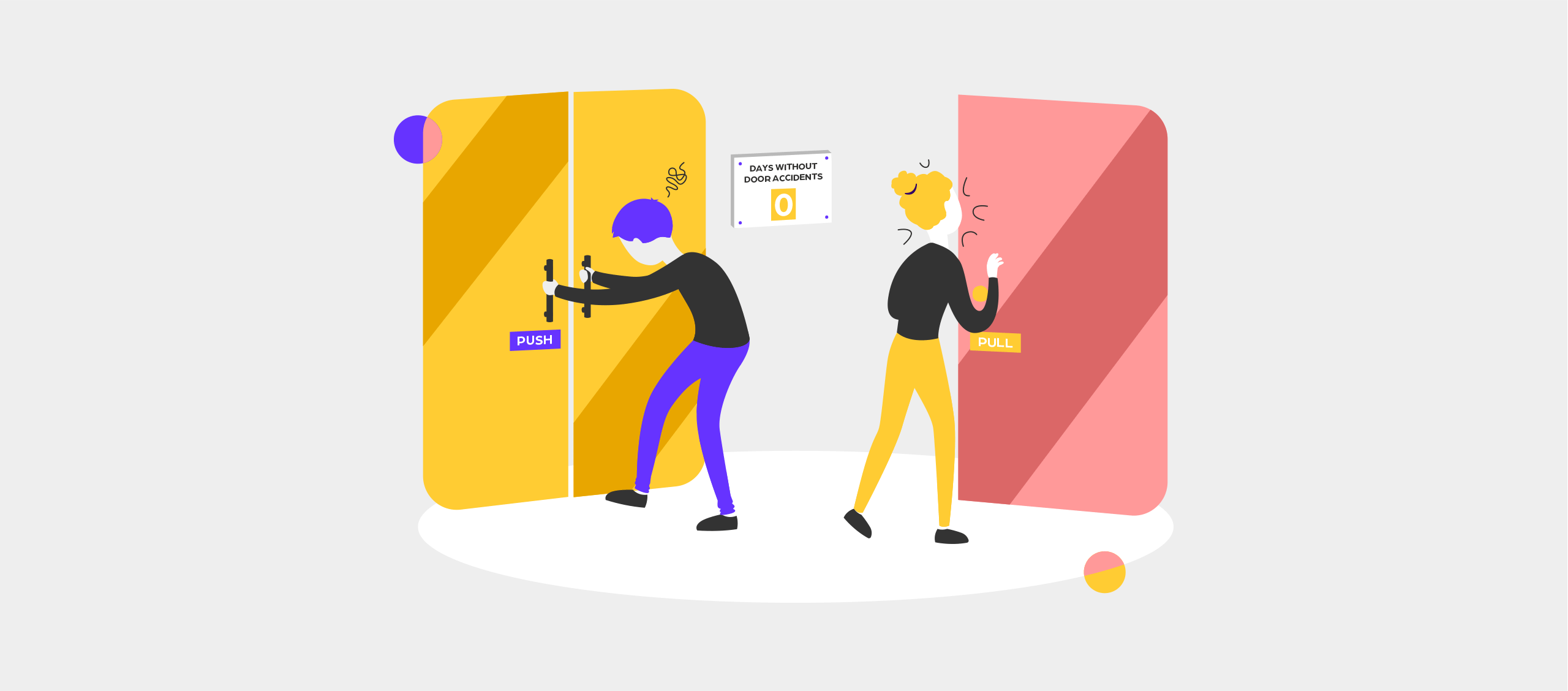
Okay, now let’s go back to our door. The affordance of the door is to open and close. To clarify this to the users, door knobs or handles are added to the door. These are the signifiers.
So why would you pull a door that should actually be pushed to open? The only reason you made this mistake is because the signifier, the door knob, gave you the impression you had to pull it. The perceived affordance of the door was opening towards you while the real affordance was in the opposite direction. The signifier wasn’t clear. This means it was not your fault you made a mistake, it’s the fault of the designer.

When designing for forgiveness, the designer needs to put in a bit more effort by implementing a system similar to the one depicted in the image above. With a door like this, you would have never made the same mistake. The handles clearly indicate how they should be used, as they only permit the correct actions. These signifiers convey the door’s affordance much more effectively.
Whenever you pull to open a door while you should have pushed, don’t blame yourself. Blame the designer of the door.
Janao Denys, Business & Service Designer – Quest
Additional signifiers can be added such as the words ‘pull’ and ‘push’, but well-designed door knobs should make this unnecessary.
Digital affordance
Creating good affordance in user interfaces is more difficult than it is with physical products. All interactions happen on your screen which means objects can’t have tactile properties. There are no handles to open doors, only two-dimensional elements that are clickable or not.
In the digital world, users rely even more on signifiers to understand the affordance of elements. The user must know at a glance what each button does. That’s why it’s very important that the perceived affordance corresponds to the real affordance by using the correct signifier.
Click here: at first you may think that this is a link (=perceived affordance) but if you click on it you will notice that it is not. The perceived affordance and the real affordance are different and cause confusion. The signifiers here are the color, the underline and also the words that are used.

Which button would you click? Most people automatically choose the one on the left. This is because we have learned that this is a clickable element, just like with the blue link above. The signifiers here are the shape and color of the button, the text also clarifies what the button does.

Often 3D effects are added to buttons. This way it looks more like a real button making it obvious you can click on it, especially to people who don’t use user interfaces that often. This imitation of reality is called skeuomorphism and is a technique often used in digital products.
Everyone knows the mentioned examples of signifiers. They are used everywhere in the same way so you as a user learn what the affordance of such an element is. You know you can click on these elements and you can guess fairly accurately what the result will be.
Good user interfaces use these well-known signifiers so new users can easily maneuver through the interface. If a user has to put in too much effort, chances are he’s going elsewhere. If the ease of use is high, he will return faster.
2. Safety nets
Most products have safety nets built in. No real nets of course, but features that fulfill this function. Just like a safety net catches the acrobat when he falls off his rope, these features absorb the negative impact of possible mistakes.
When you drive a car you are quite literally surrounded by safety nets. There is an airbag in your steering wheel and guard rails at the side of the road. If you were to drive off the road due to a mistake, these safety nets ensure that your injuries are limited.
Often safety nets are also built into digital products. A good example of this is the autosave of Google docs. When your computer shuts down because you forgot to plug in the charger, you don’t have to worry about losing hours of work. The saving is done automatically for you.
Reversability of actions
This principle is especially important in digital products. We often do something without really thinking about it or considering the consequences. Whether you accidentally deleted a photo or made an adjustment in the wrong layer in Photoshop, we sometimes want to be able to roll back an action. Fortunately, there are systems like Ctrl-Z in Photoshop that make this possible.
3. Warnings
A warning alerts the user to potential dangers when performing certain actions. Opening this door could clearly be dangerous. You come across warnings on a daily basis in the shape of traffic signs or for example on labels of household products.

Confirmation
Sometimes a user is not aware of the consequences of a certain action. If there might be lasting negative or harmful effects, it is best to ask the user to confirm this action again.

Two-step verification
When an action can happen by accident, two-step verification is often built in. For example, when switching off your phone, you have to press the on/off button for a longer time and then confirm again that you want to switch off the device. If this were not the case, many people would accidentally turn their phones off in their pockets or handbags.
With two-step verification the user has to perform two actions to get the desired result. It is more likely that this will only be done on purpose, which makes an error less easy to make.
Warnings can slow down the use of a product significantly. Imagine that you have to confirm every action or perform additional actions every time you want to do something. That’s why warnings are only used for important, irreversible actions.
4. Help
Everyone can experience problems when using a product or service. Maybe you can’t find the right information or your product breaks and you need help. This help can exist in various shapes. A physical product most often has a manual, online you will often find chatbots and a telephone help desk may also solve your problem.

In conclusion, designing for forgiveness is crucial for creating products that meet the needs of users. As human beings, we are prone to making mistakes, and it’s the responsibility of designers to anticipate these errors and create products that are forgiving of them. By incorporating strategies such as clear signifiers, informative feedback, and simple undo and redo options, designers can ensure that their products are more user-friendly and less frustrating to use. Ultimately, prioritizing forgiveness in design can lead to greater user satisfaction, increased productivity, and improved overall product performance.

Is designing for forgiveness enough to meet the needs of users?
Not all users have the same needs. Inclusive design aims at embracing the whole range of human diversity taking into account a full spectrum of people to ultimately accommodate diverse markets and audiences.

