Page content
Challenge
Full Cycle is a California-based biotechnology company that addresses three major global issues: plastic pollution, food waste and climate change. How? They transform organic waste into PHA, a high-performing, compostable alternative to oil-based plastics.
Their problem: their brand didn’t match their ambitions and their website brought them the wrong kind of leads. So they asked us to:
- create a new logo and visual identity for their amazing organization
- create a new website that strengthened their image and facilitated their sales process.
The logo
To align all parties involved we organized a design direction workshop which resulted in a moodboard and key associations. The results were clear, but also surprising for some of the participants. It soon became clear that Full Cycle really wanted to stand out from the crowd. They didn’t want a typical biotech logo.
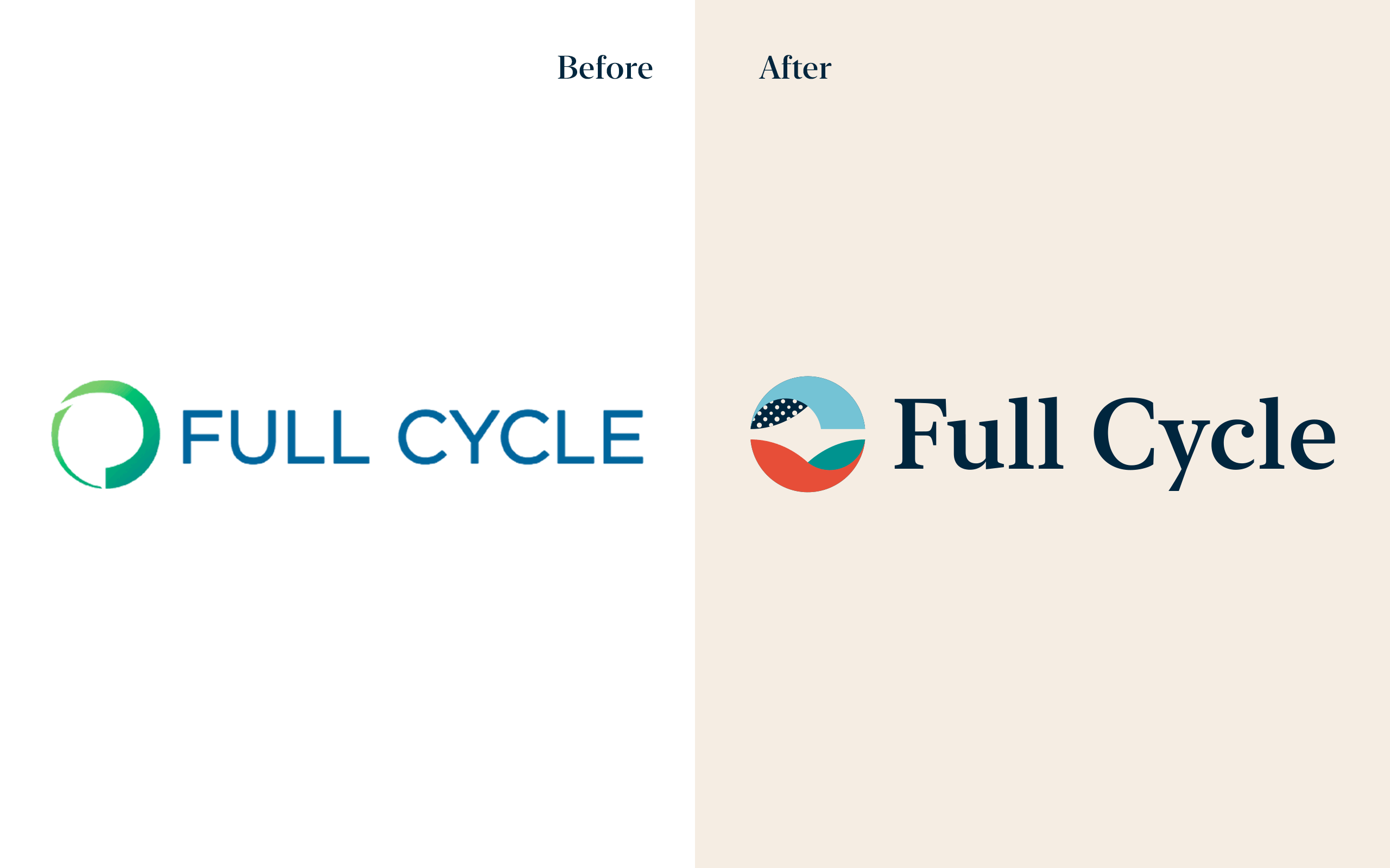
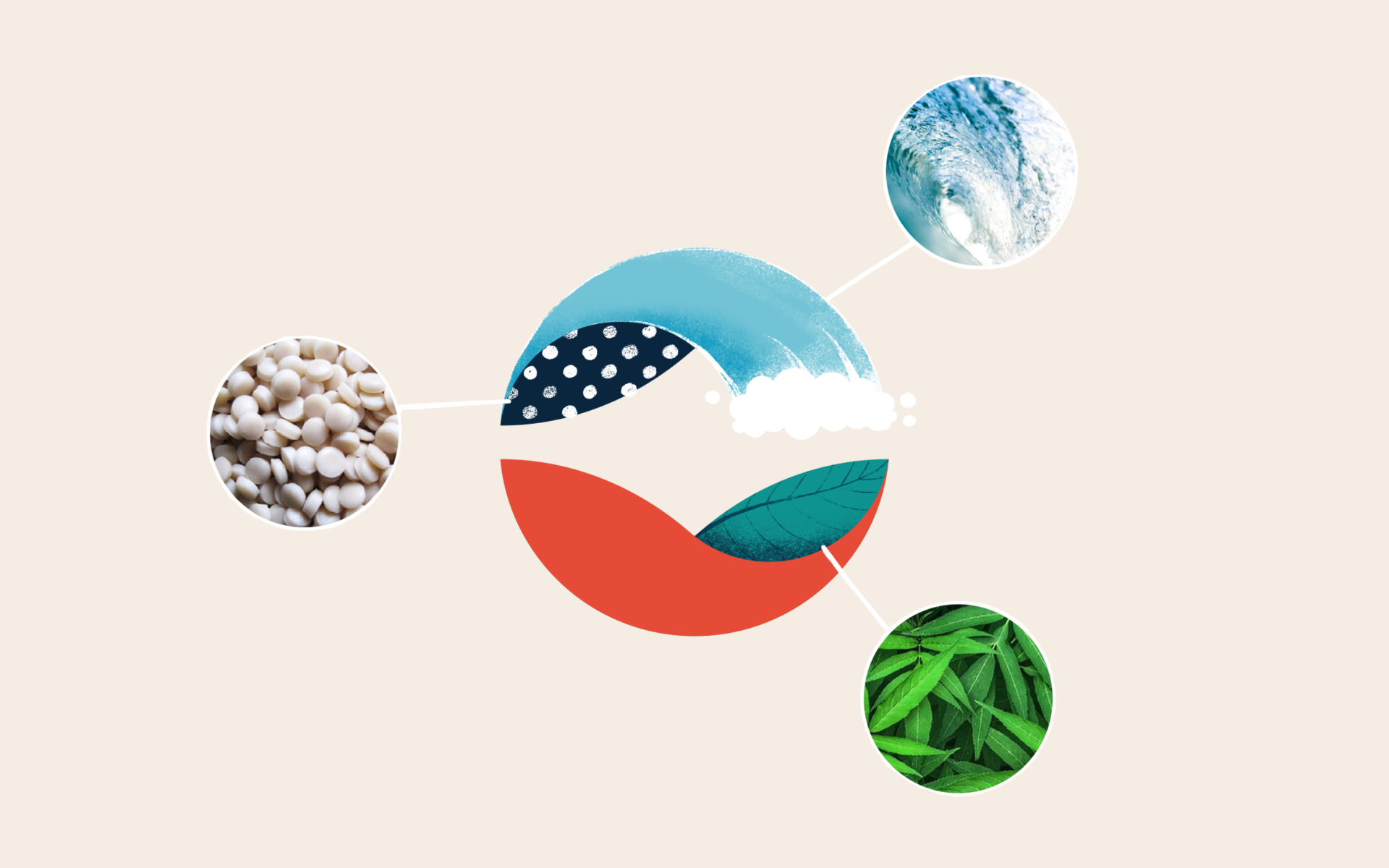
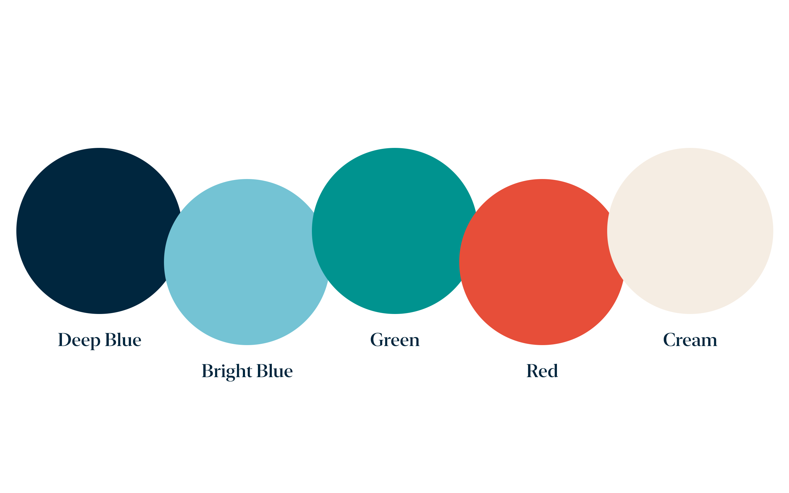
The logo clearly tells the story of Full Cycle in a simple and elegant way. During the design direction workshop, we noticed the team was really drawn to red. We think this color is a perfect addition to highlight their unique vision and boldness.
Picture carousel
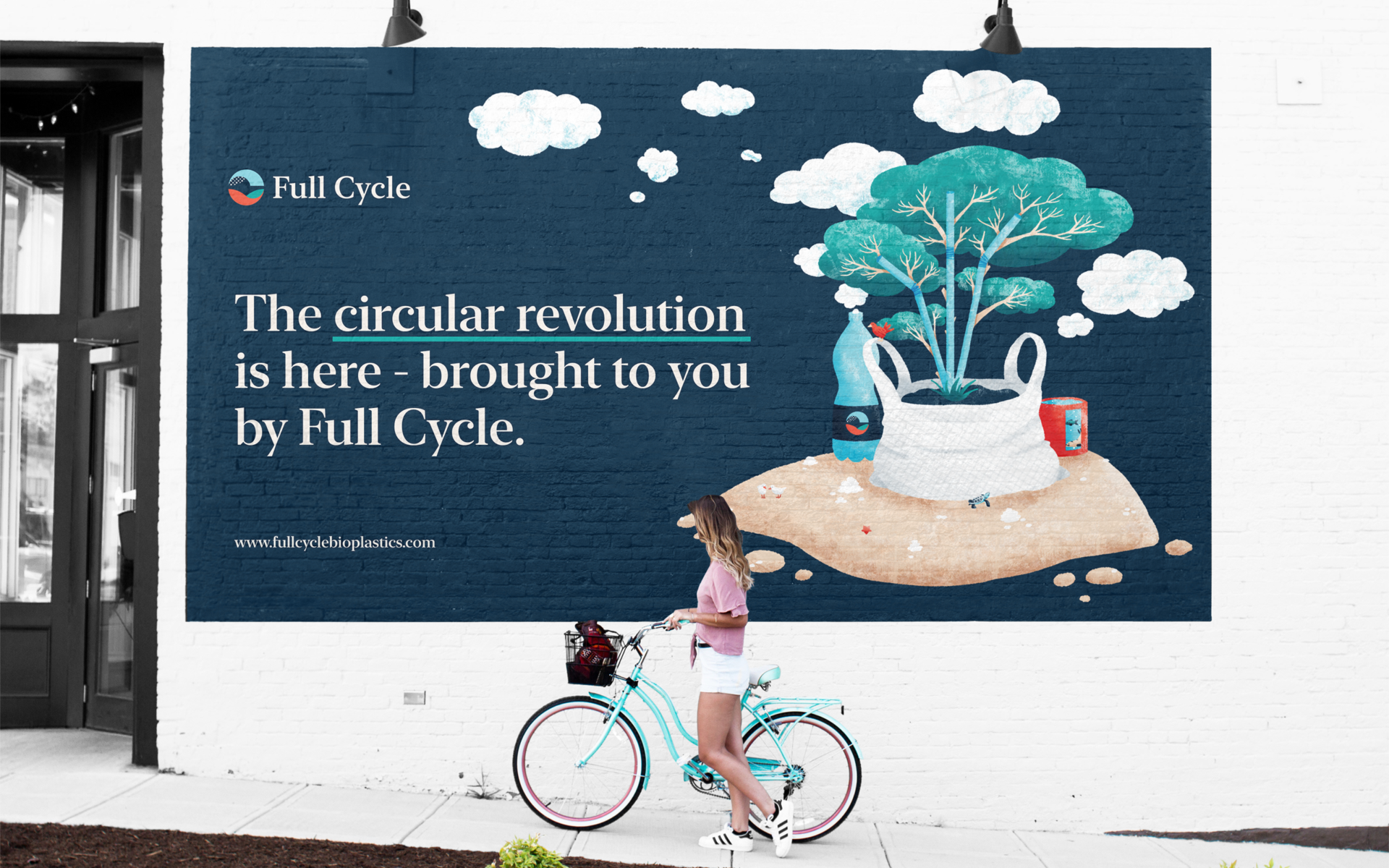
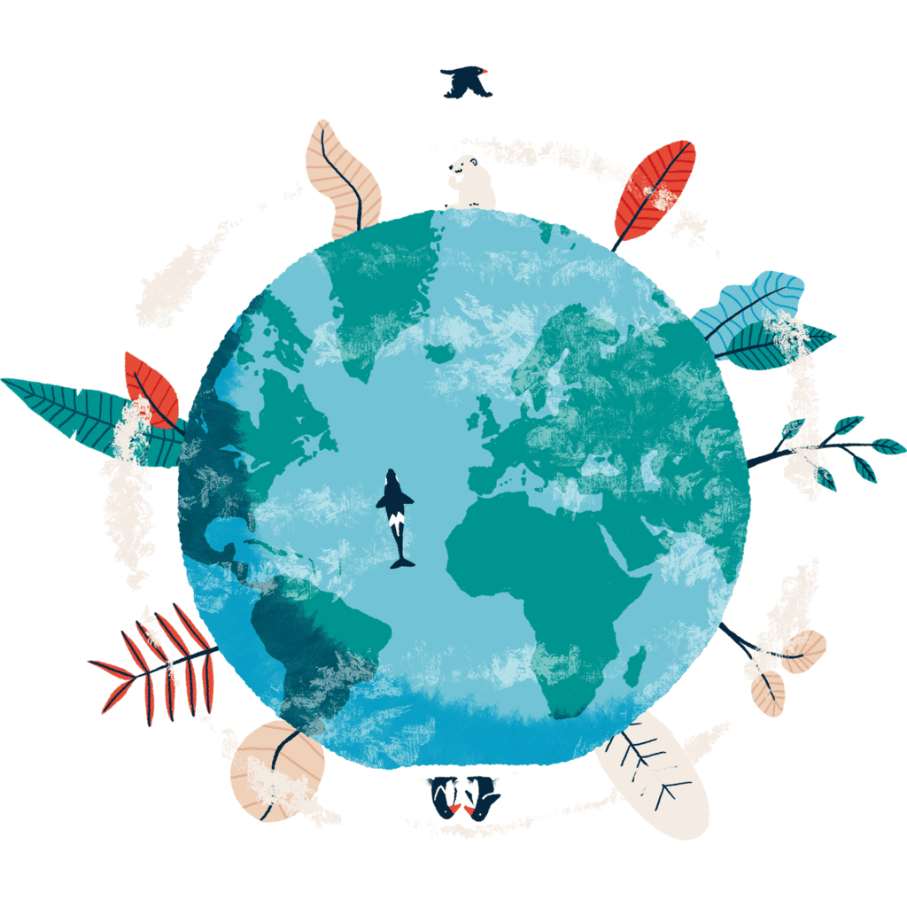
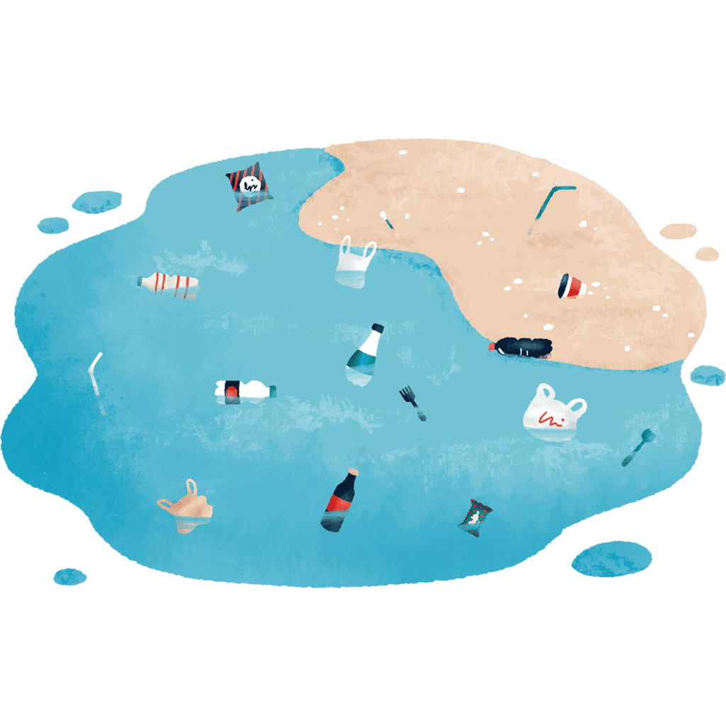
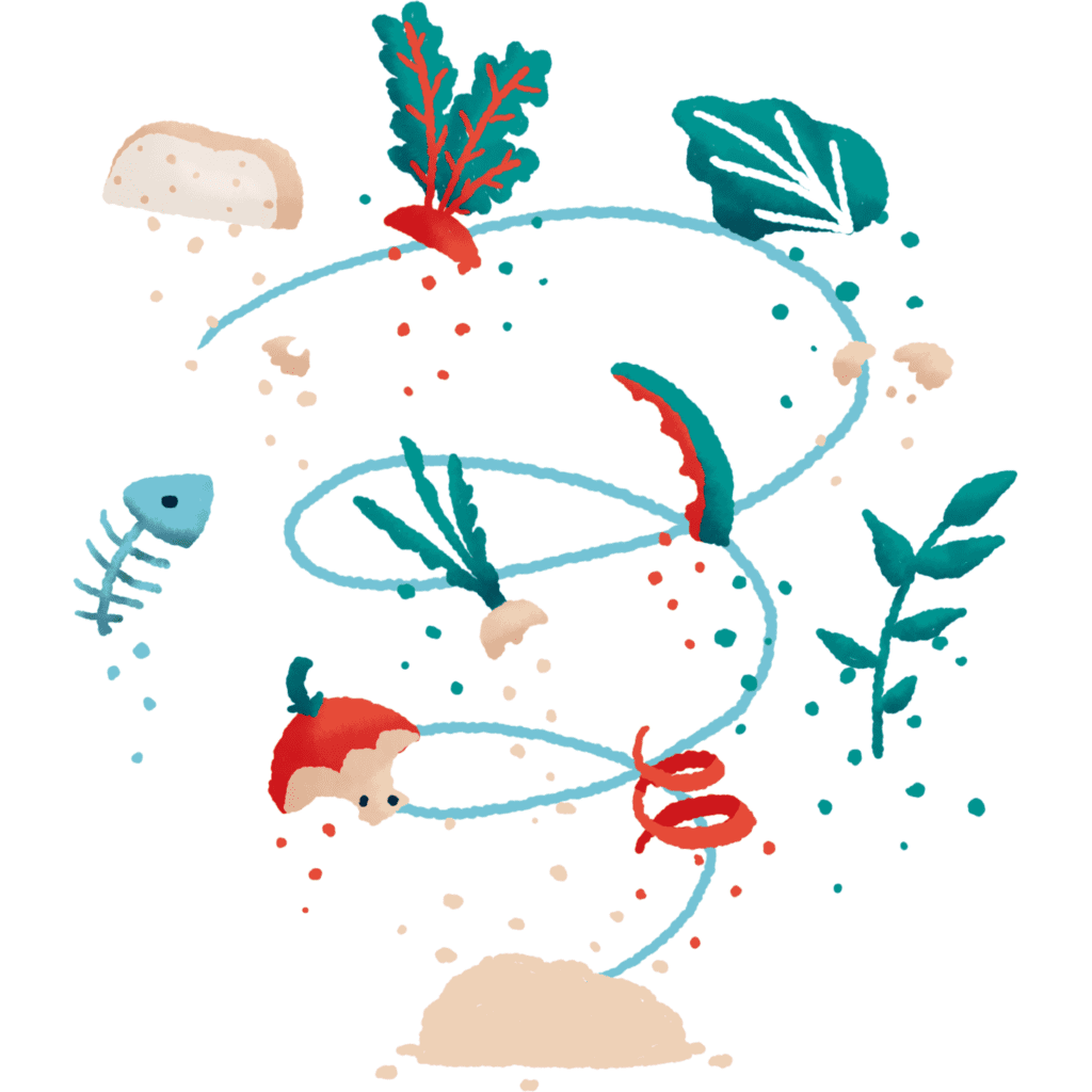
A strong visual style enriched with custom illustrations
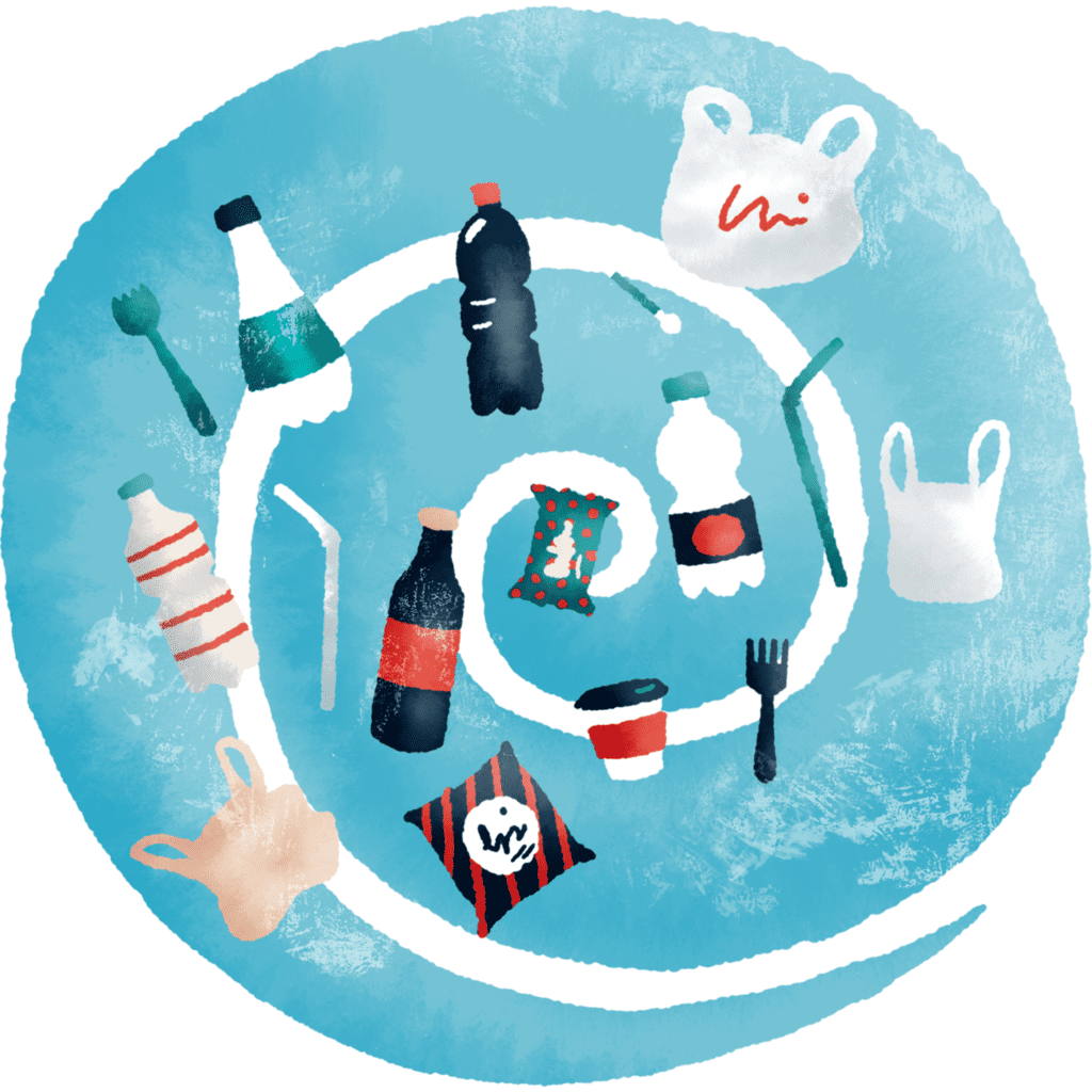
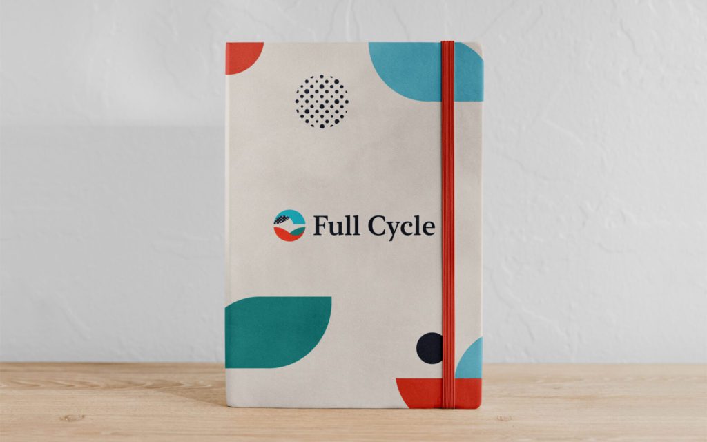
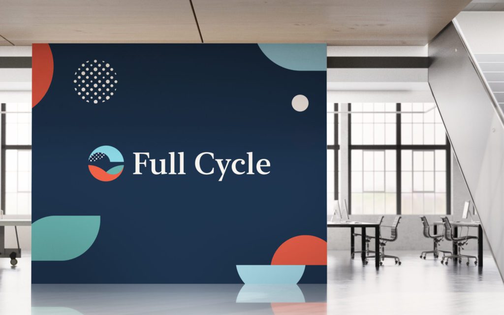
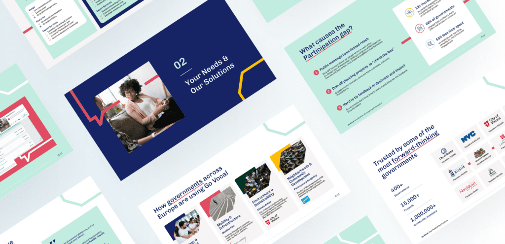
We enriched Full Cycle’s visual style with a plethora of custom illustrations and animations that allowed for better storytelling. These illustrations were integrated into their website, presentations, pitch decks, etc.
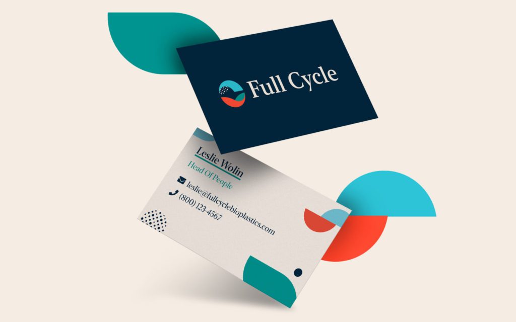
At the end of the process, all of the brand guidelines were captured in an extensive style guide for the Full Cycle team.
